DramaFlow
A short-drama platform connecting continuous viewing, discovery and contextual purchases.
DramaFlow is an independent product concept for following short-form stories. I designed the journey from finding a series and resuming an episode to understanding paid access, topping up coins and continuing after payment, across desktop and mobile.
Design a viewing journey that can support the business
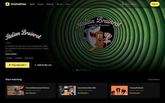
DramaFlow brings two tasks together: help viewers stay with a story, and give them a clear way to pay for more of it. The design covers discovery, playback, returning visits, rewards, coins and the journey back from checkout. I worked across the information architecture, desktop and mobile interfaces, shared components and interaction-state specifications.
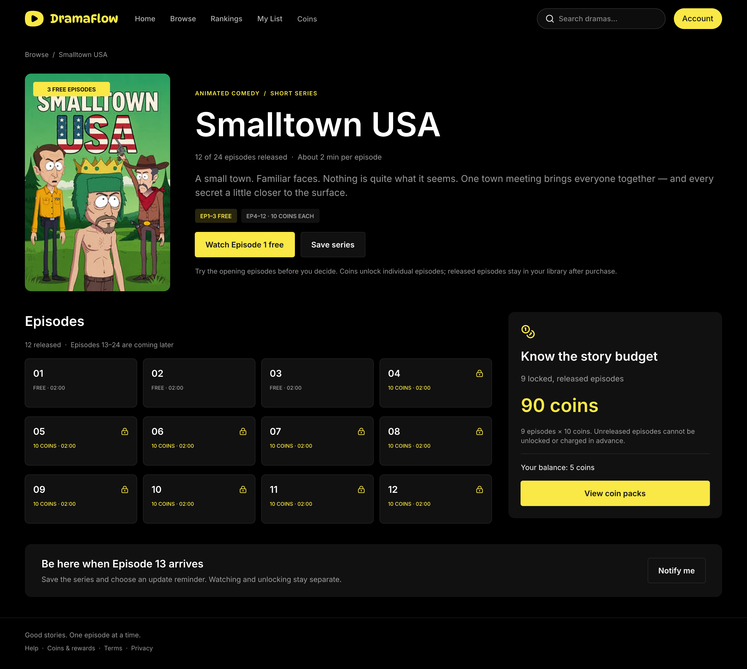
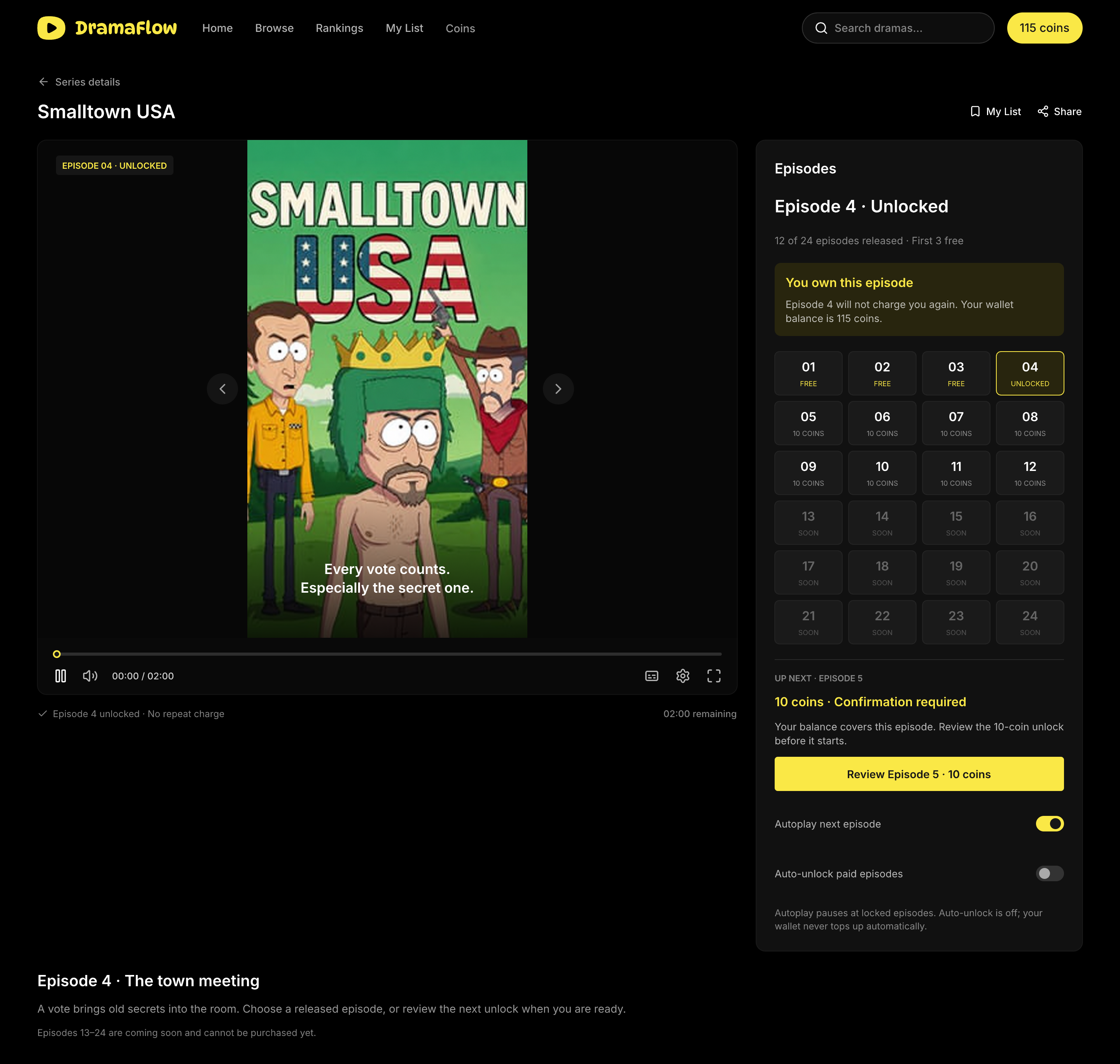
DramaFlow supports two access models. The Interdimensional Postman is a free, completed series of 12 episodes. Smalltown USA demonstrates the paid model: 12 of 24 episodes are released, the first three are free, and each released episode after that costs 10 coins. Episodes that have not yet been released stay unavailable for purchase.
Checkout research informed several starting decisions: ask for fewer unnecessary inputs, show complete costs before commitment, and support a relevant payment method. The research provides a basis for the design, while the offer, placement and pricing still need testing with DramaFlow viewers.
Give returning viewers a clear place to continue
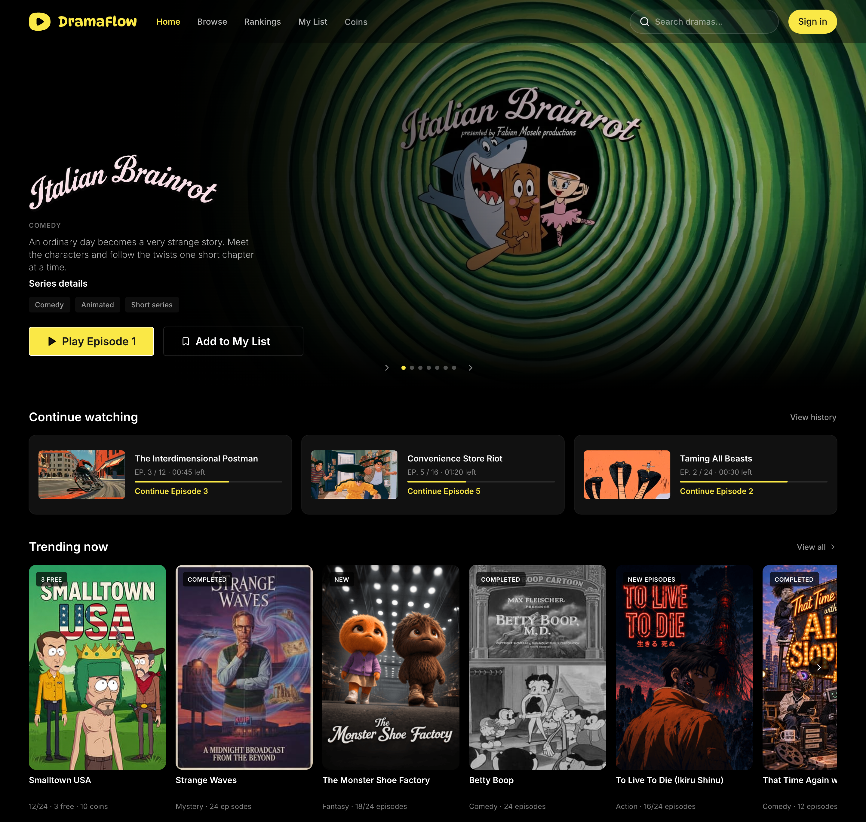
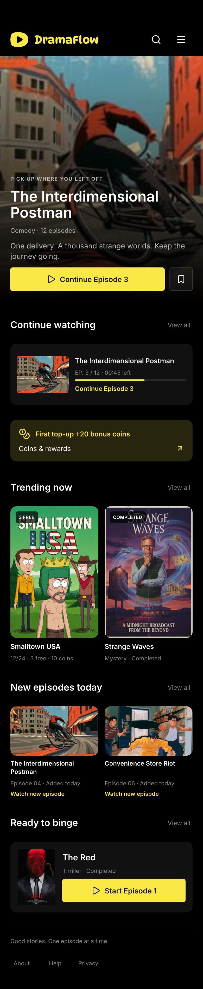
A short-drama homepage serves two moments: choosing something new and returning to an unfinished story. I separated Continue Watching from recommendations, keeping the episode, saved progress and remaining time beside the resume action. First-time visitors receive clear starting points; returning viewers have a direct route into playback.
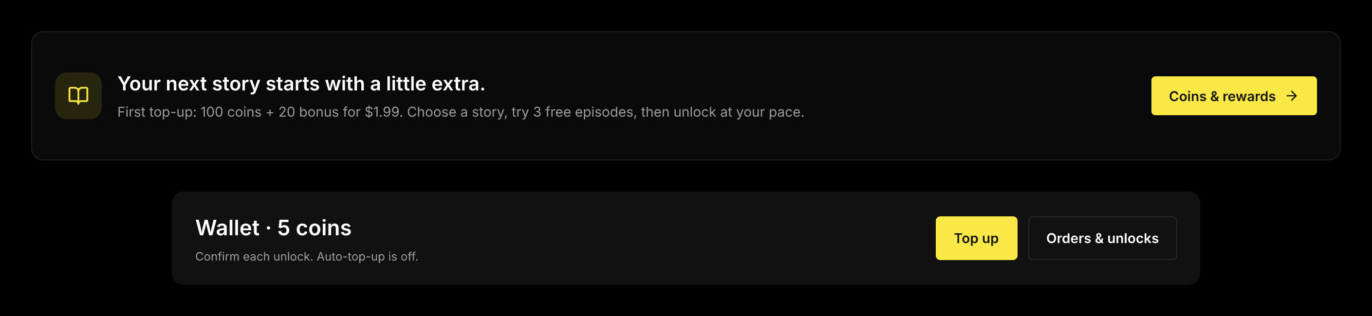
Coins and rewards are discoverable from the page, with a first-top-up benefit explained in context. The entry leads to an offer page rather than interrupting arrival with a purchase dialog. On mobile, the compact entry sits after Continue Watching, keeping the main viewing task prominent.
Make choosing a series an informed decision
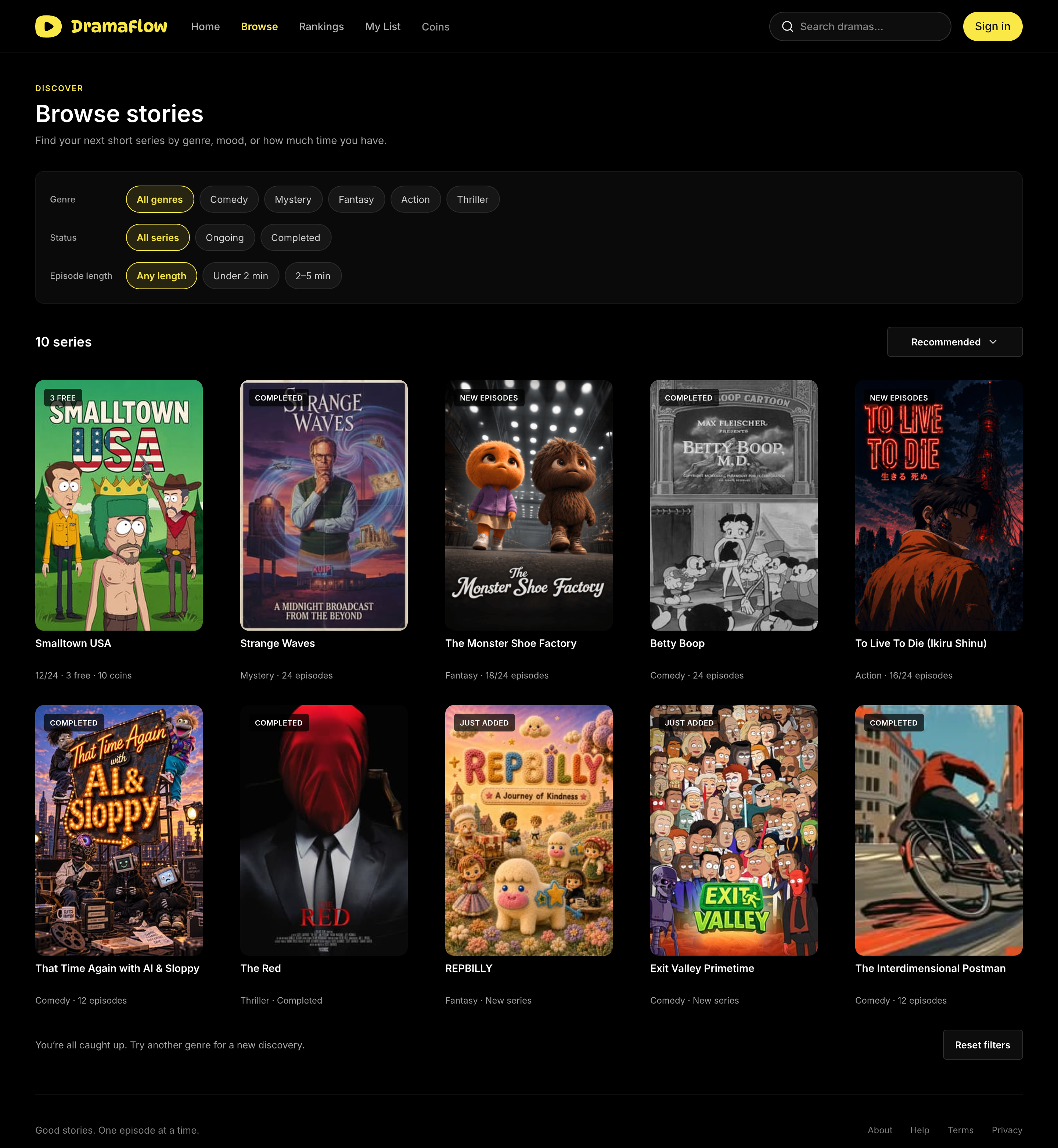
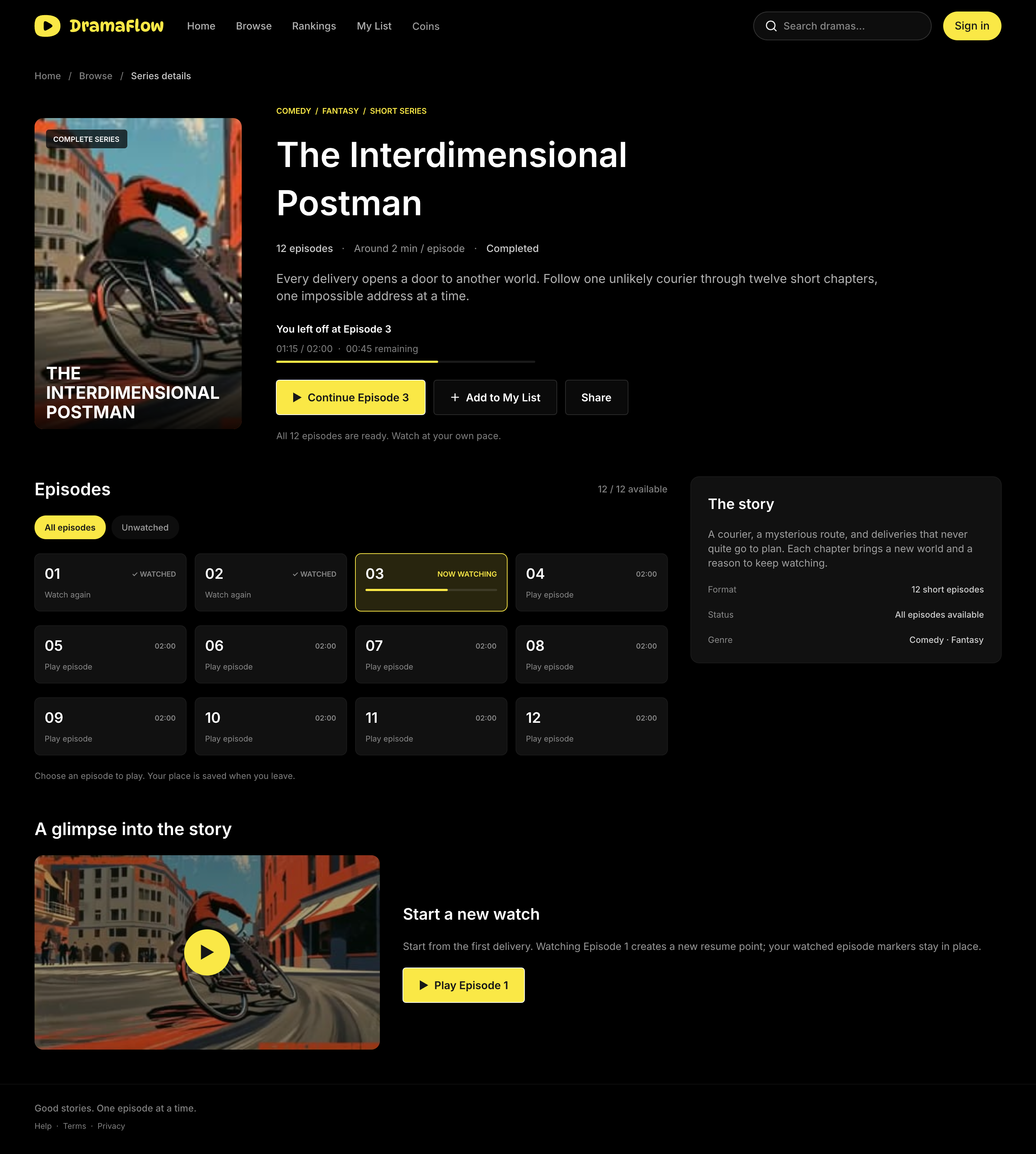
Browse filters combine genre, release status and episode length, so viewers can look for a quick session or a completed series. The detail page brings the premise, release information and episode list together. Its primary action changes with viewing history: start at Episode 1, resume the saved position or watch again.
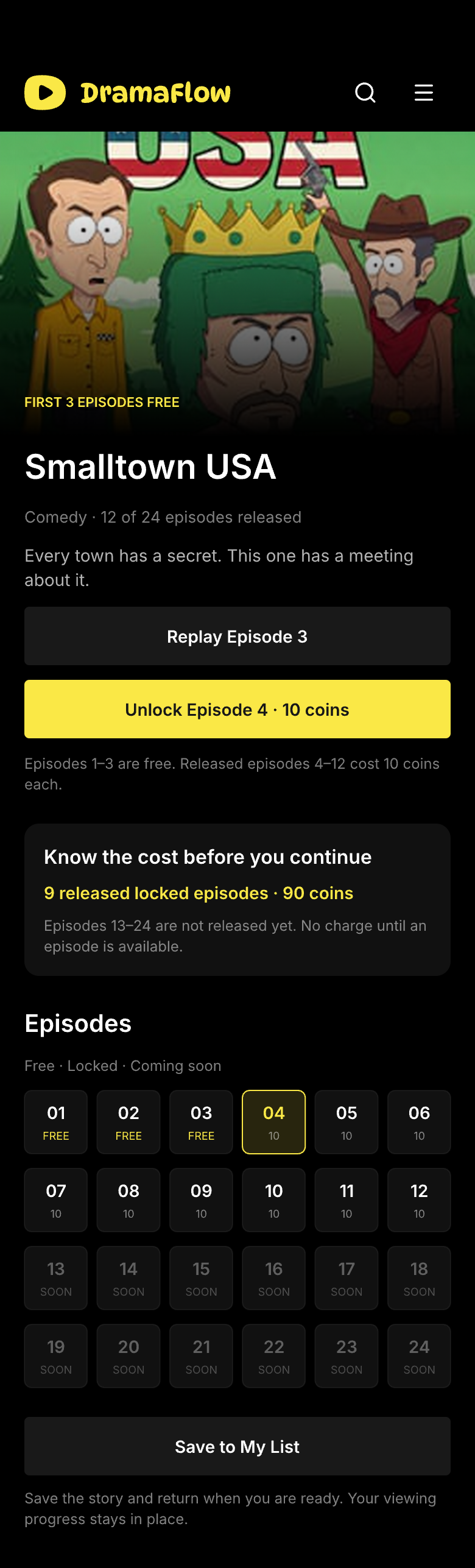
Access and release status are separate pieces of information. The paid series identifies its three free episodes and the 10-coin price that follows. Episode states distinguish free, already unlocked, locked and not yet released, helping viewers understand the commitment before entering the player.
Keep free playback continuous, with a way to stop
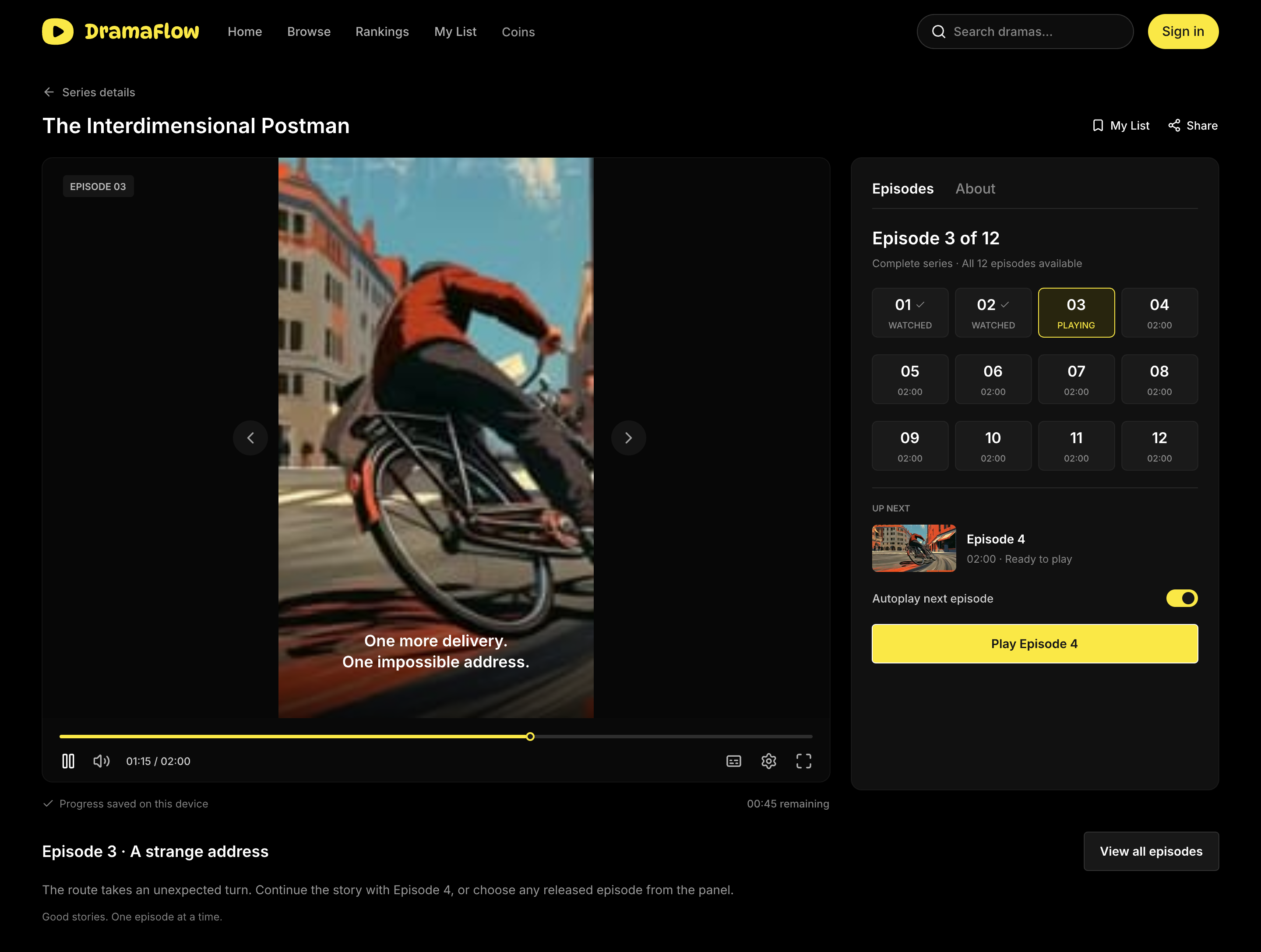
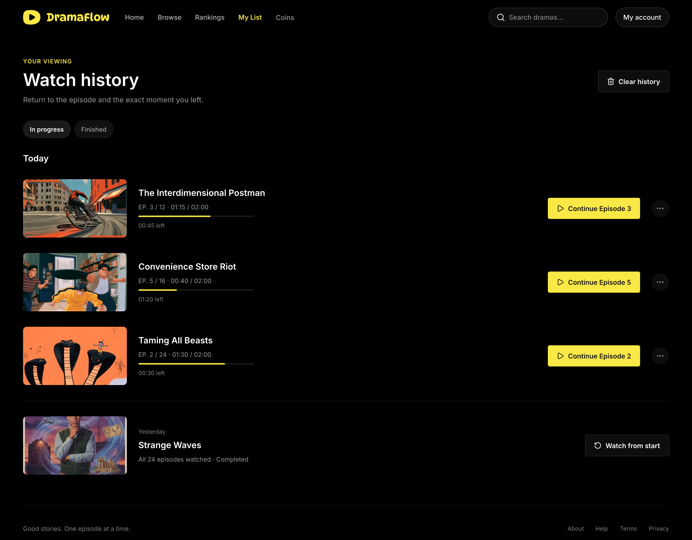
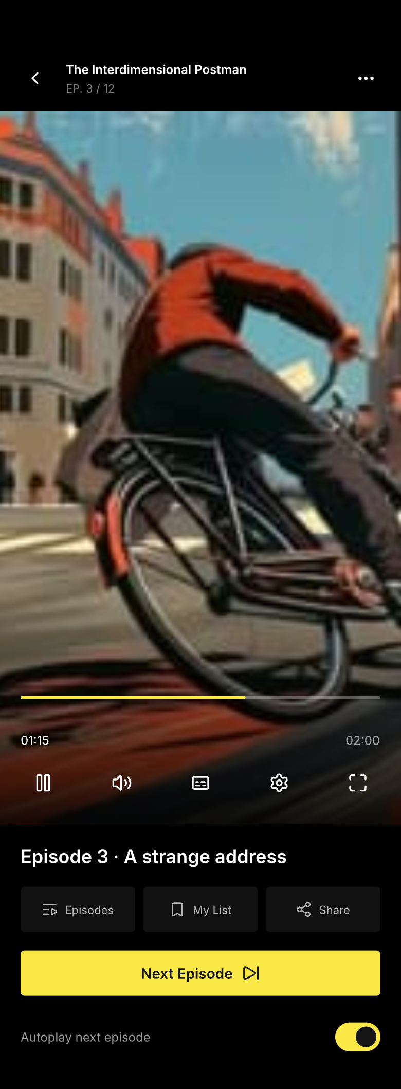
For a free series, DramaFlow keeps the viewing context visible through each episode. Episode 3 resumes at 01:15 of 02:00, with 45 seconds remaining. The current episode, progress, episode list and next action stay together across the home, detail and player screens.
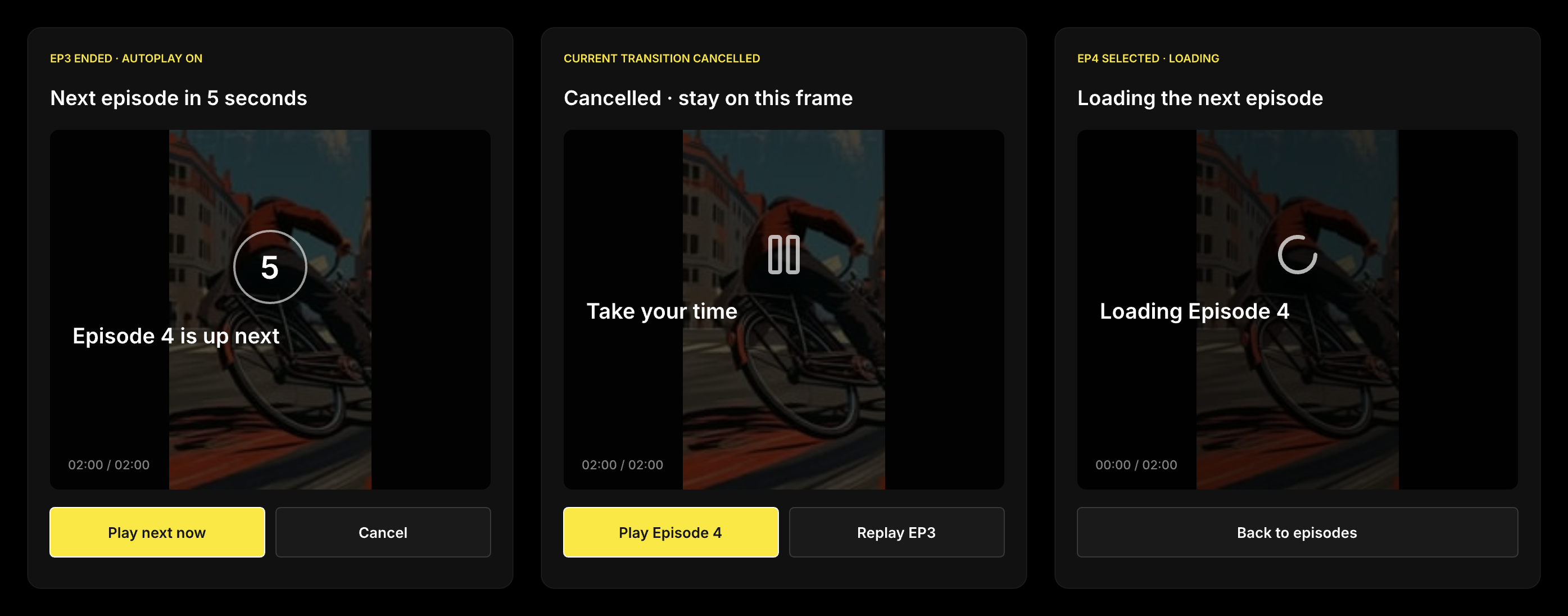
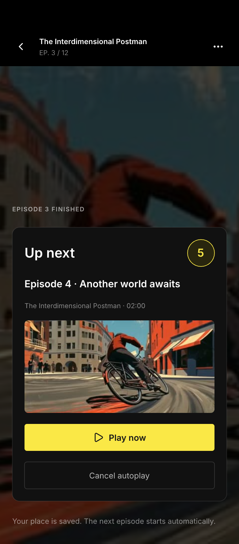
At the end of an episode, a five-second countdown offers Play Next and Cancel. Cancelling stops that transition; the autoplay preference remains a separate setting. A completed series and a series waiting for a release have different end states. Loading and failure specifications retain the saved position rather than silently restarting the episode.
Ask for a purchase at a meaningful point in the story
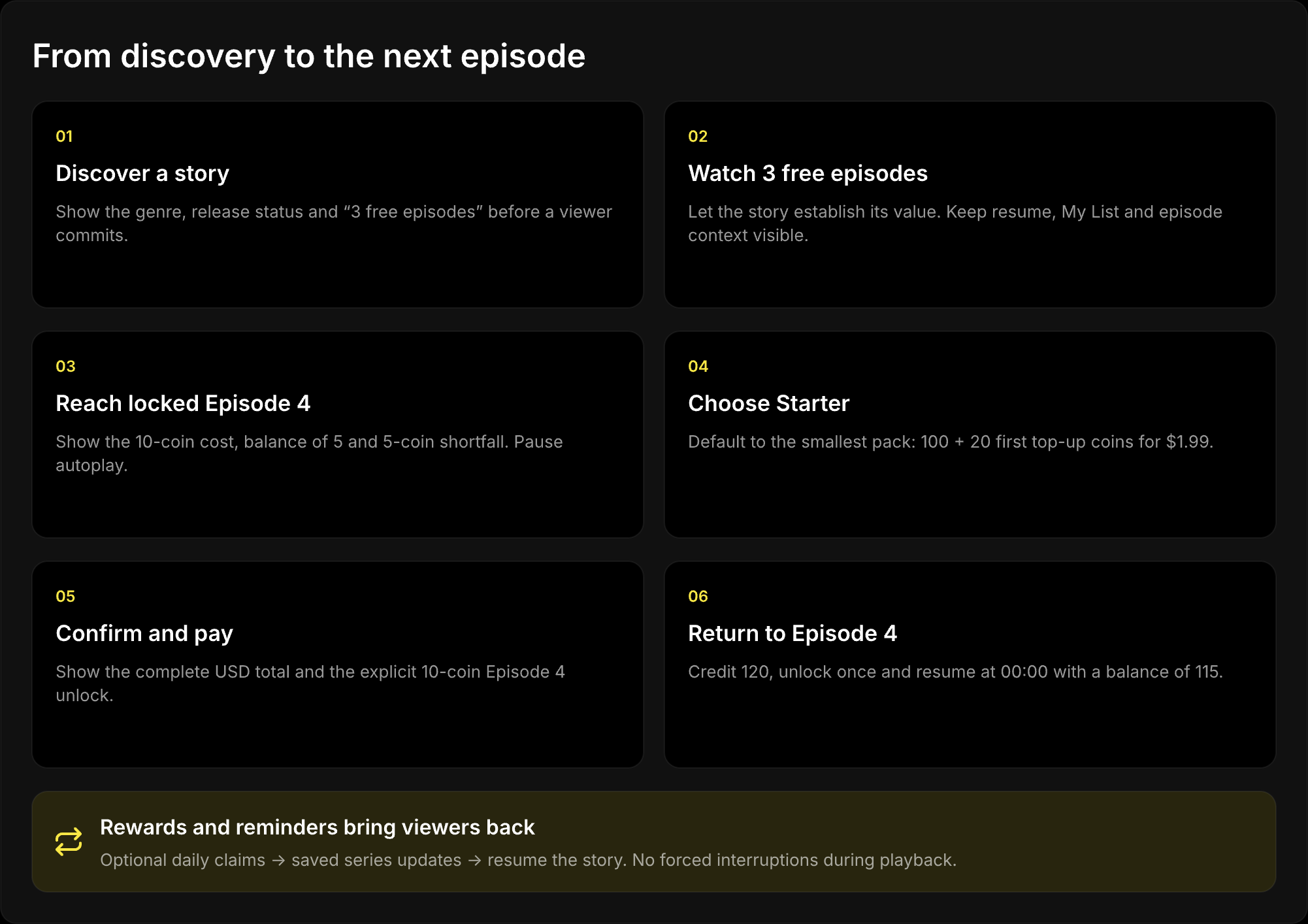
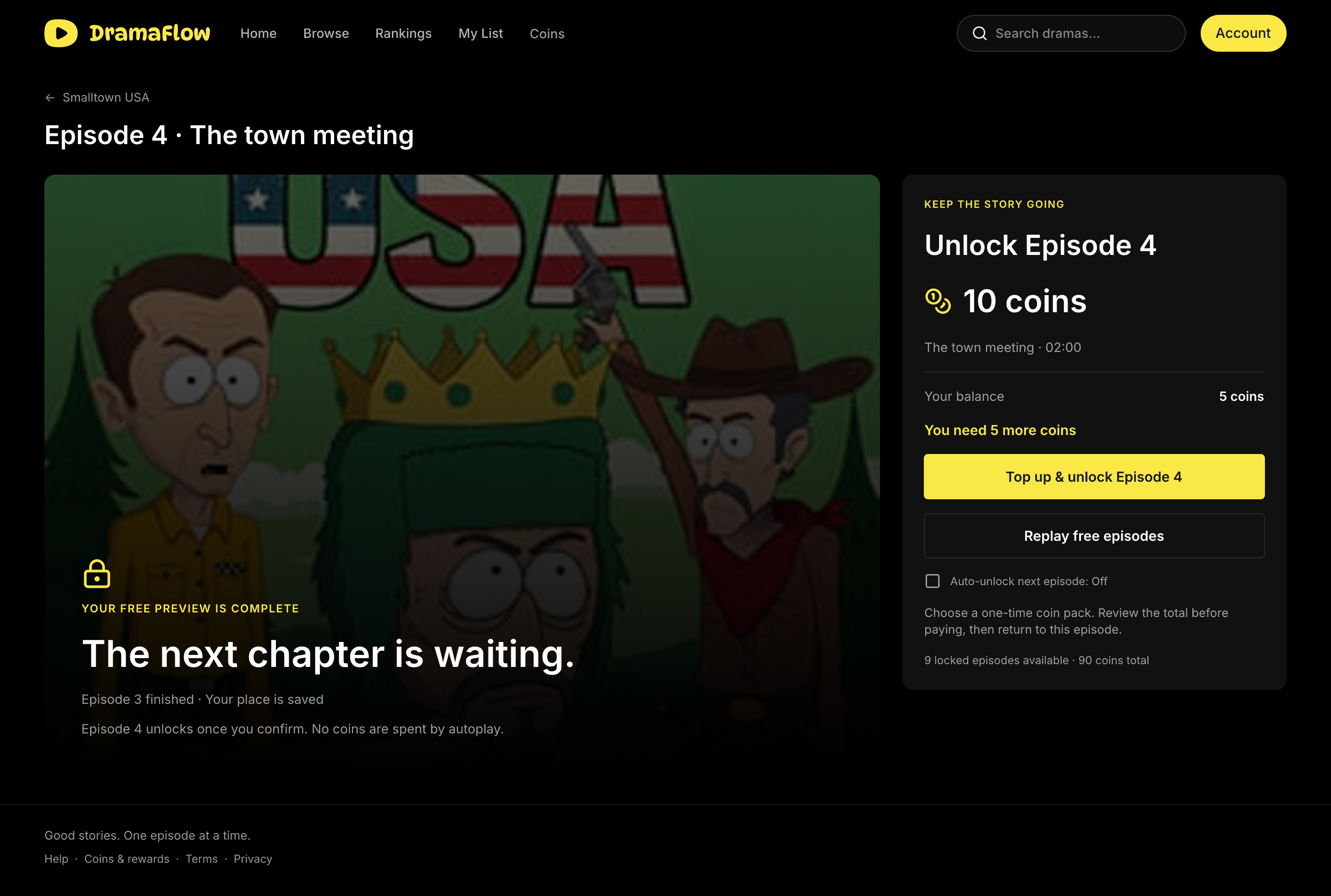
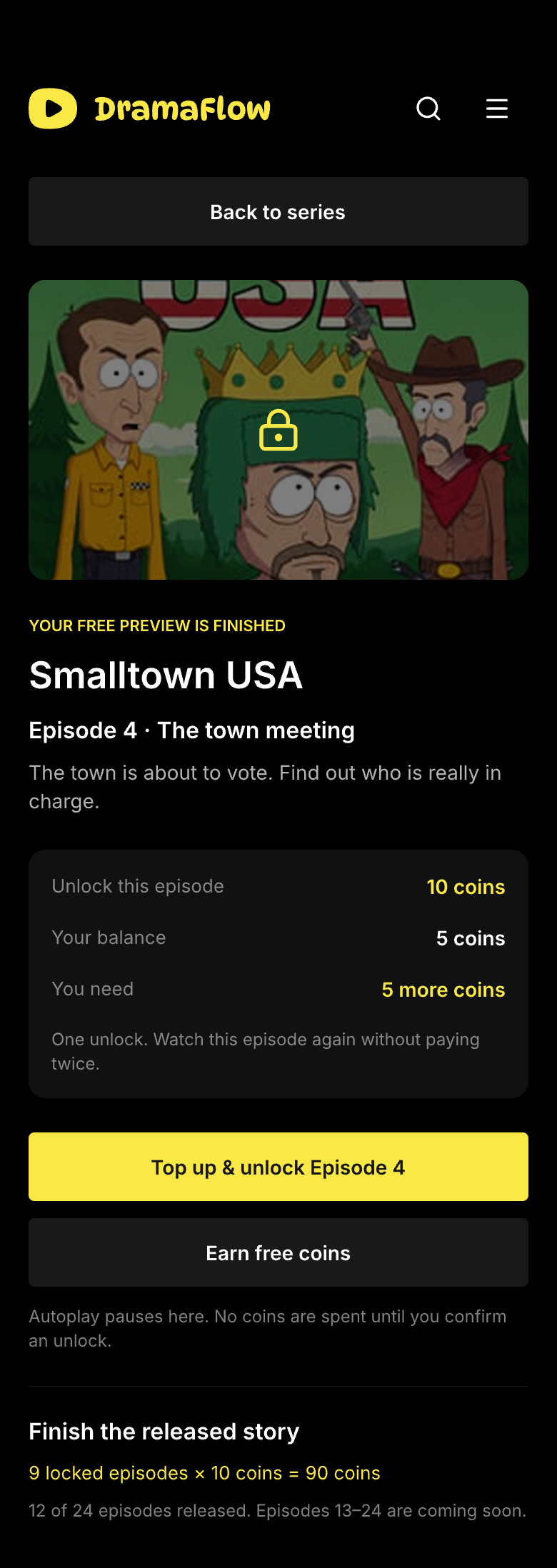
Smalltown USA introduces monetization after three free episodes. The detail page makes that boundary visible in advance. When the viewer reaches Episode 4, the player pauses at the lock and retains the series, episode and next-step context. The offer explains the 10-coin cost, the current balance of 5 and the 5-coin shortfall.
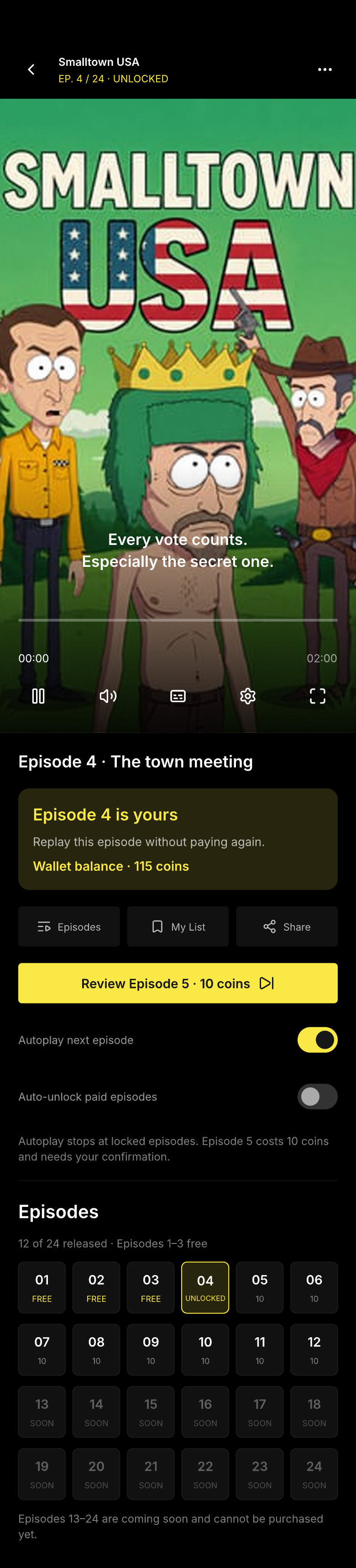
The primary route opens top-up options for this episode; a secondary route returns to the available free content. Autoplay cannot cross a locked episode by spending coins. Auto-unlock is a separate preference, off by default, and the concept never automatically tops up the wallet. An episode already purchased is not charged again.
Translate coin packs into a viewing decision
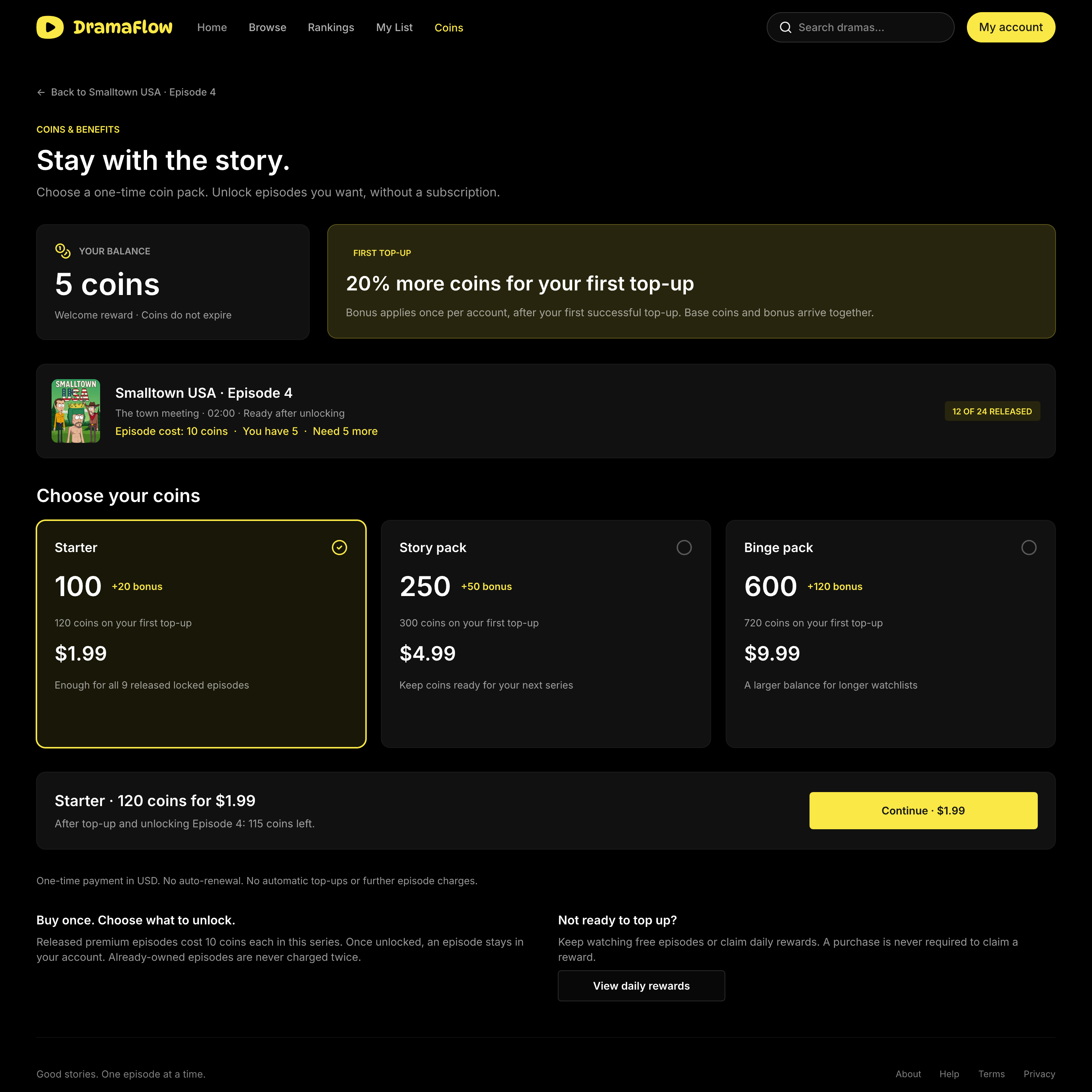
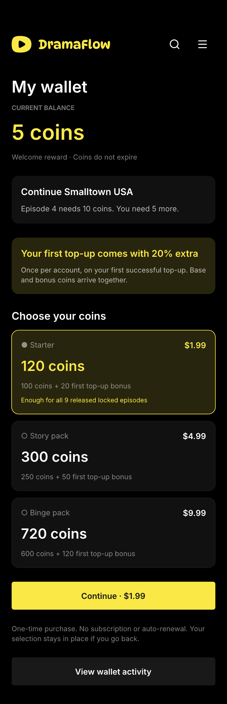
A coin quantity is difficult to evaluate without knowing what it buys. The wallet connects the recommended Starter pack to the current story: its nine released locked episodes require 90 coins. The first-purchase Starter offer contains 100 base coins and 20 bonus coins for $1.99, enough for those episodes without selecting a larger pack.
The three pack choices show base coins, the first-top-up bonus and the complete price. The bonus applies once per account, on the first successful top-up. Purchases are one-time, coins do not expire in this concept, and there is no subscription or automatic renewal. These are design assumptions used consistently across the screens, rather than validated commercial prices.
Complete payment and return to the exact episode
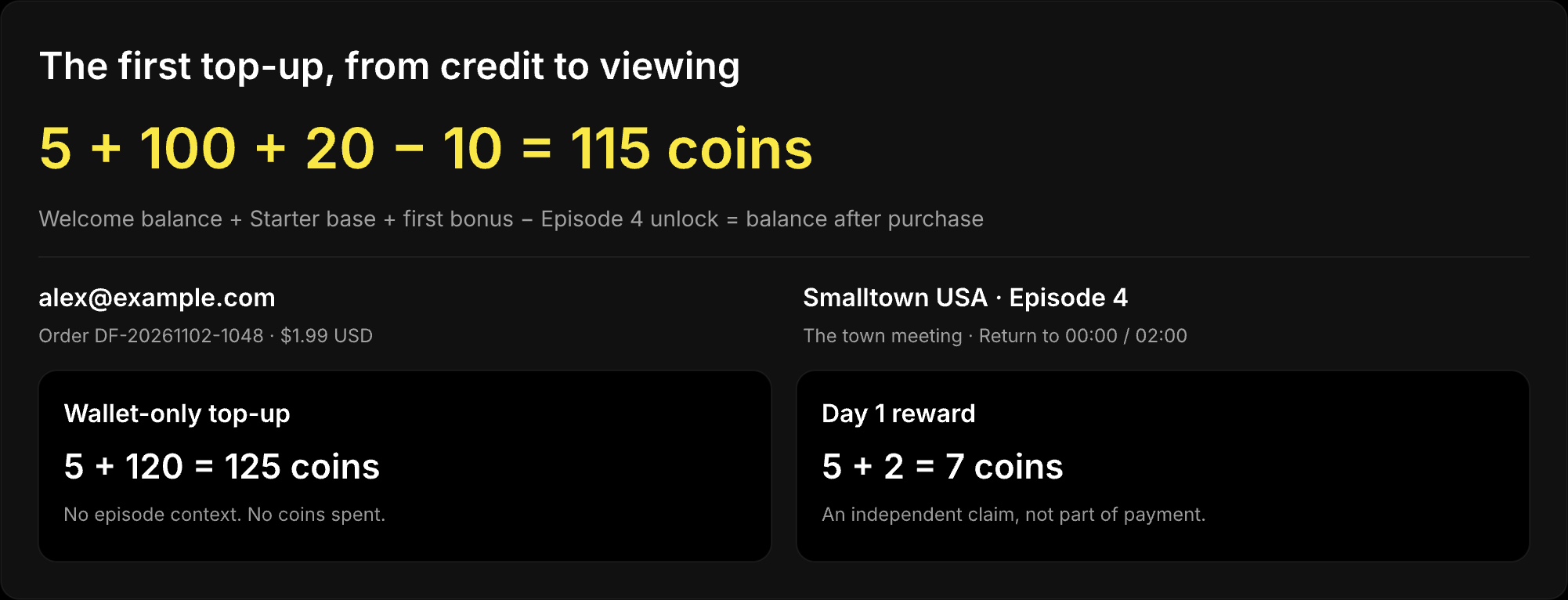
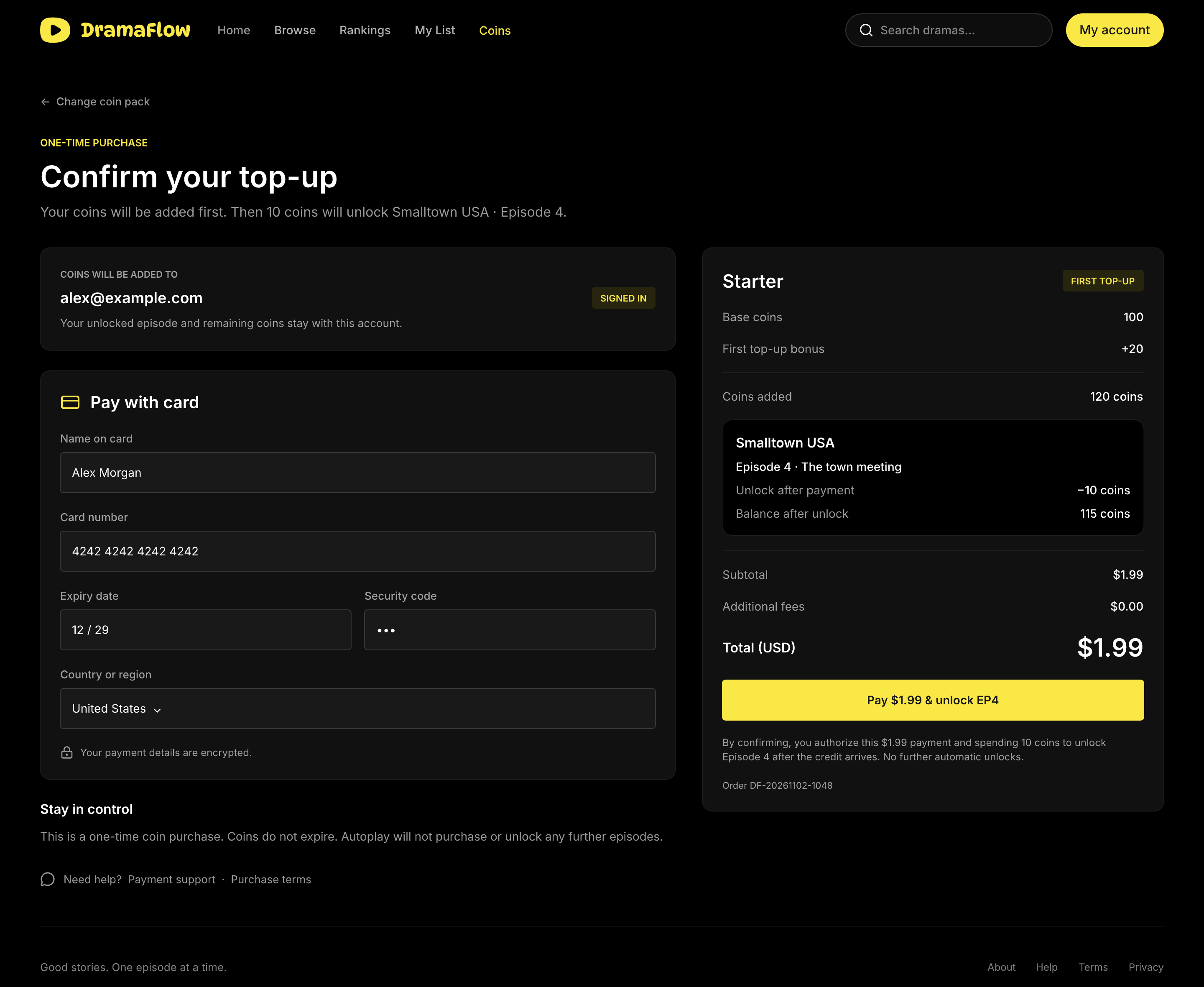
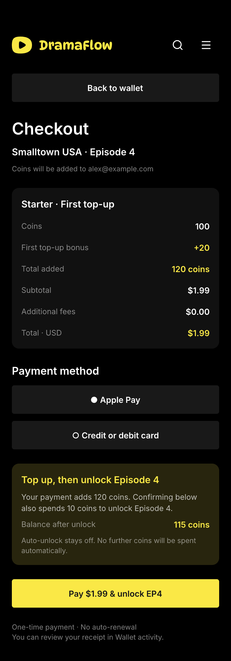
The episode purchase carries its context into checkout: Starter pack, 120 total coins, a $1.99 final charge and Episode 4. Confirming “Pay $1.99 & unlock EP4” also authorizes spending 10 coins after the top-up succeeds. It does not authorize another episode purchase or a recurring charge.
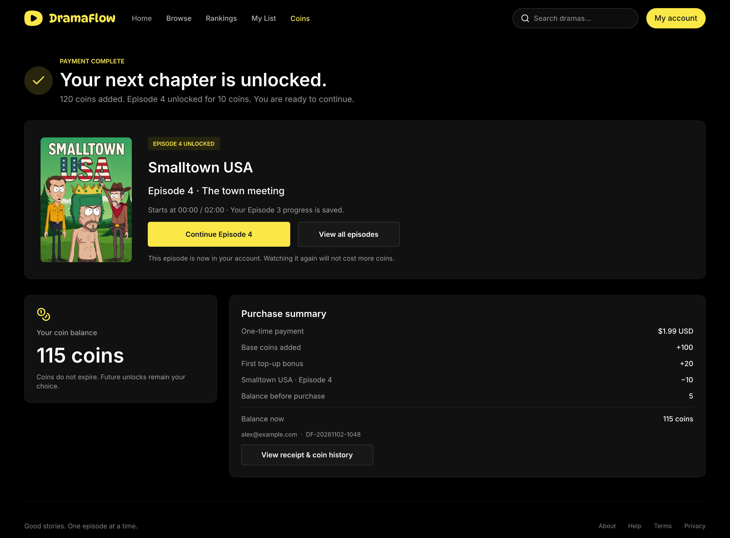
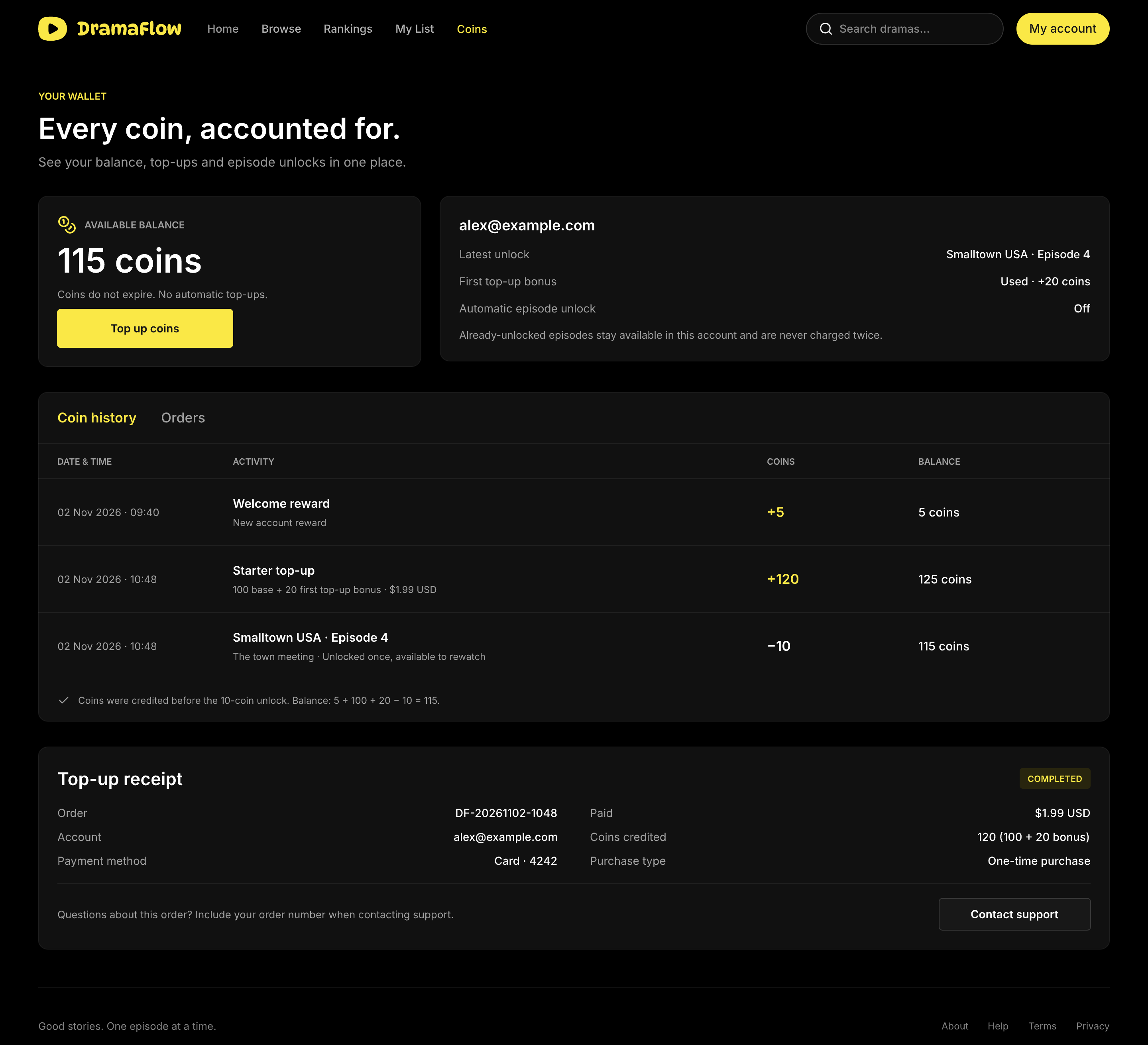
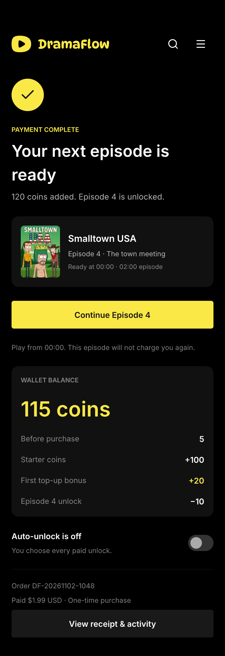
The success view makes the transaction understandable: the existing 5 coins plus 100 purchased and 20 bonus coins, minus the 10-coin episode unlock, leave 115 coins. Continue Episode 4 returns to 00:00. A top-up started from the wallet without episode context only adds coins, leaving 125; it does not spend them.
Give each payment outcome a useful next step
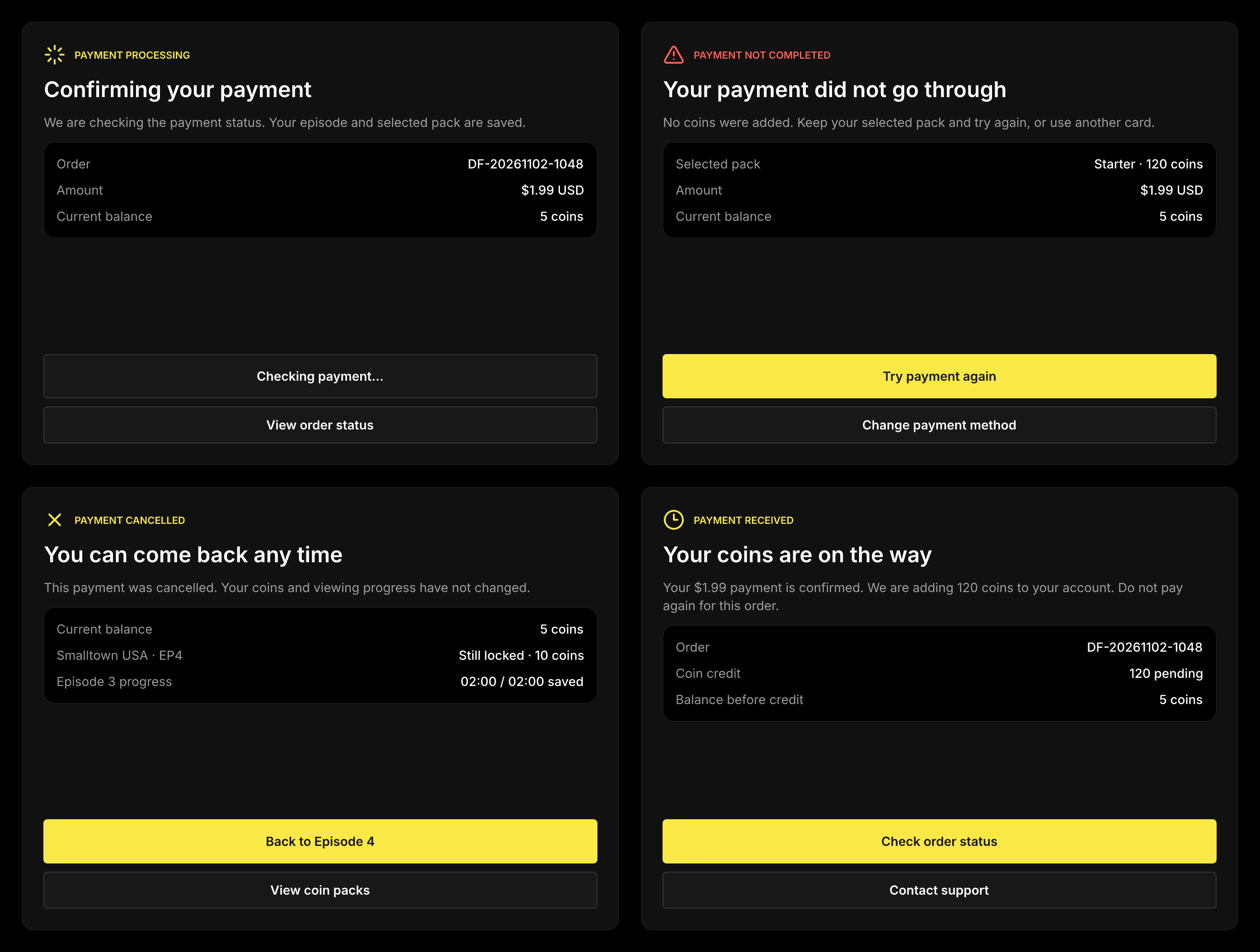
Processing, failure, cancellation and payment-confirmed-but-syncing are separate states. The design preserves the selected pack and episode while the payment is resolved. A failed attempt offers retry or a different method; a pending entitlement offers an order check instead of another payment. Cancelling returns to the locked episode with the 5-coin balance unchanged.
Make a saved story and a shared link easy to return to
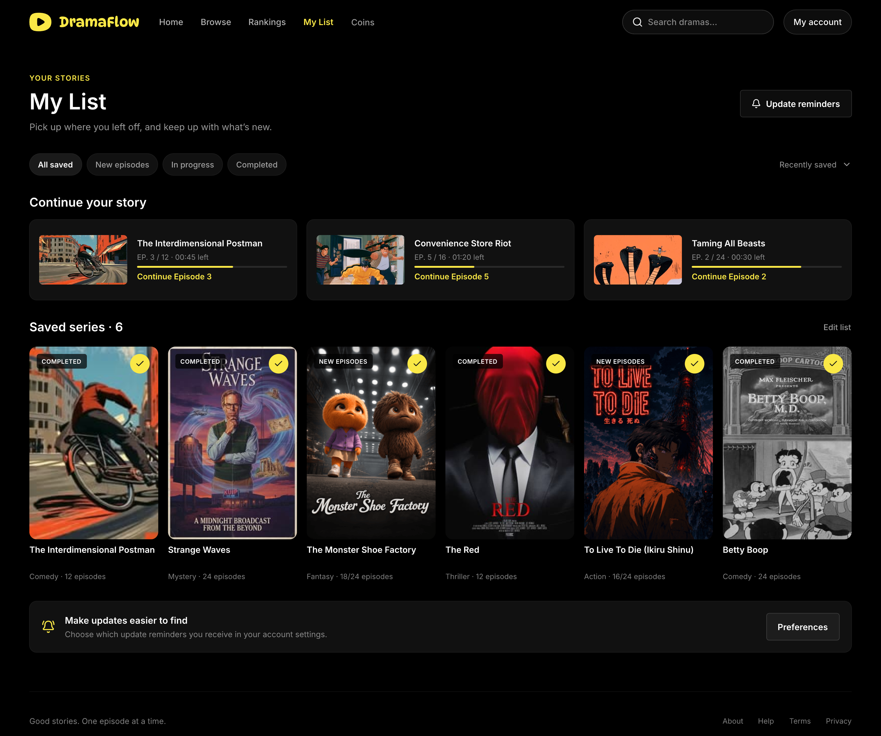
My List holds the series a viewer wants to follow; Watch History records what they have played. Both use the same progress data and resume destination. Keeping those tasks distinct supports intentional saving as well as returning without having saved a series.
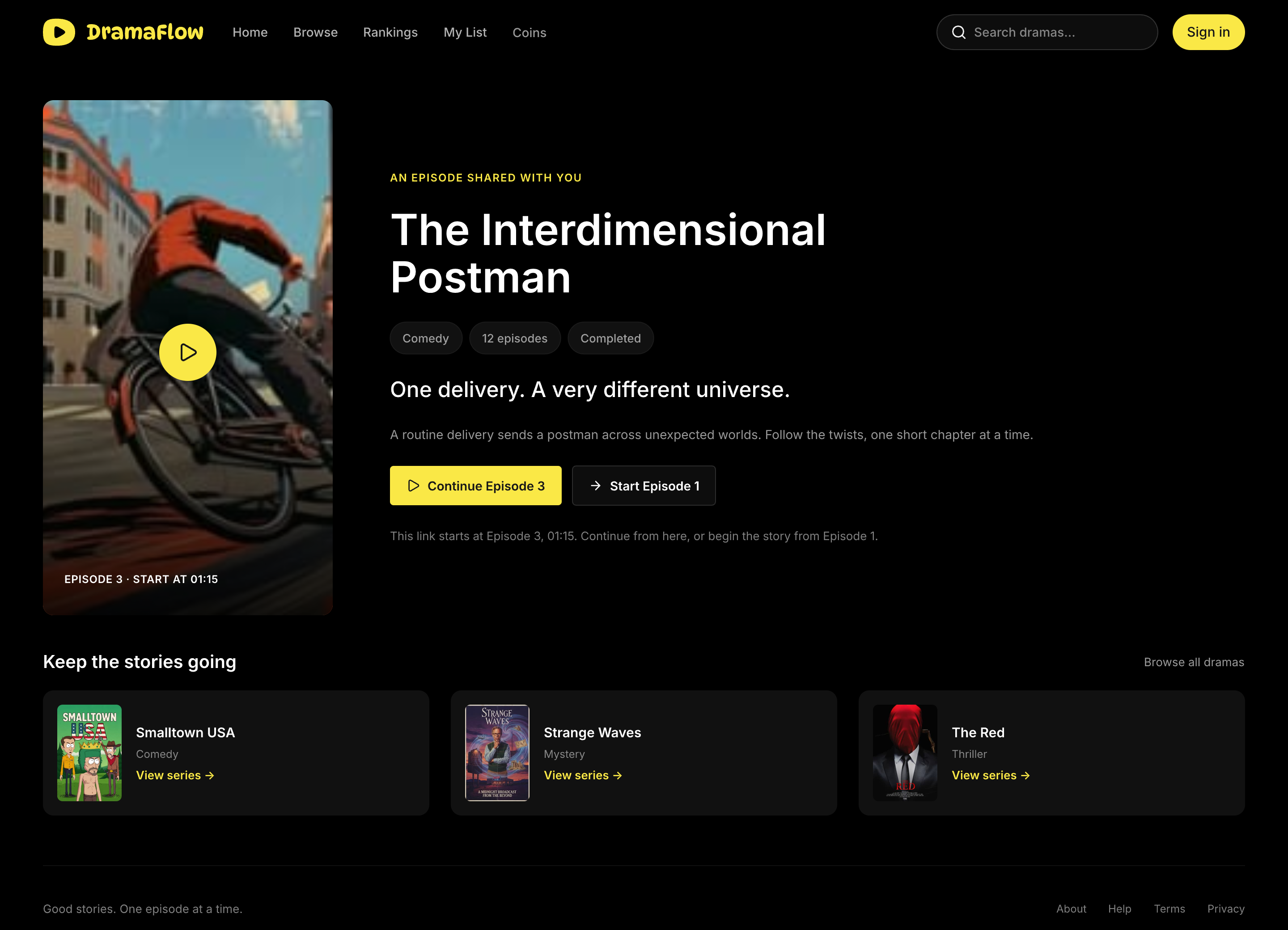
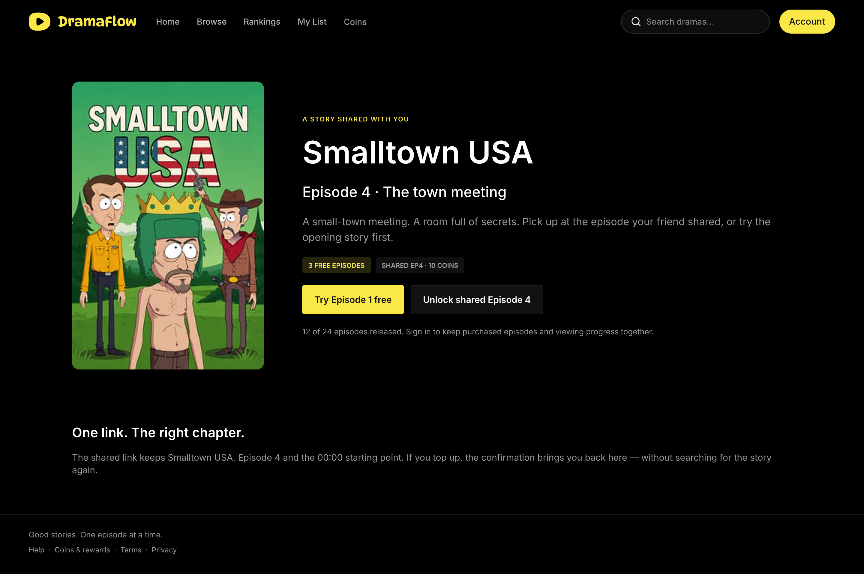
A shared link preserves its context. A free timestamp link can resume Postman at Episode 3, 01:15. A paid Smalltown link states that Episode 4 requires an unlock, rather than implying that the recipient already owns access. Purchase context is preserved, while viewing rights remain specific to the recipient’s account.
Offer another reason to return, with an accountable wallet
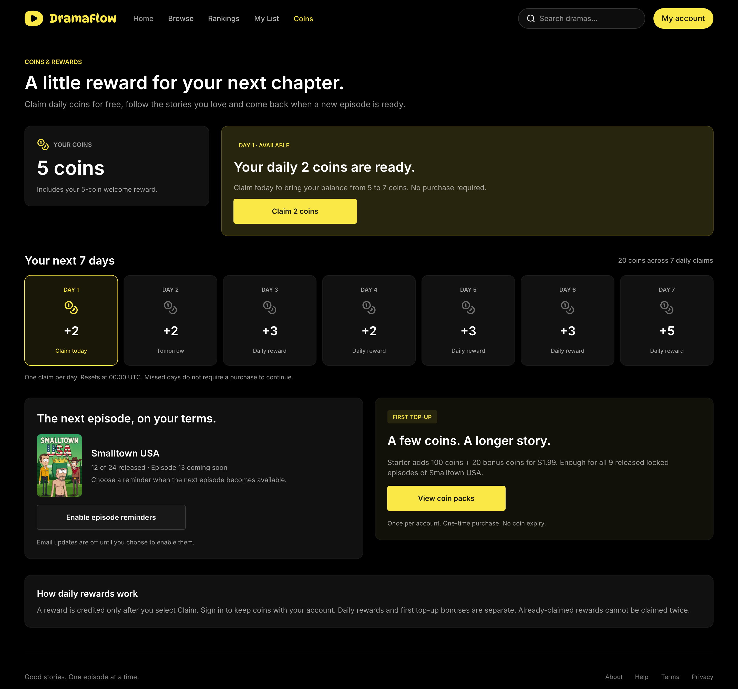
Rewards provide a separate entry for viewers who are not ready to purchase. The daily page shows the amount available today, the weekly sequence, the claim state and the next reset at 00:00 UTC. No purchase is required. The daily-reward example is separate from the checkout example: claiming Day 1 adds 2 coins to the initial 5, leaving 7.
The wallet’s records connect money, coins and viewing access. A viewer can inspect top-ups, bonus credits and episode spending, identify an unfinished order and check its status. This gives the retention entry and the paid path a common source of truth rather than treating the wallet as a number that changes without explanation.
Carry the same rules through the mobile journey
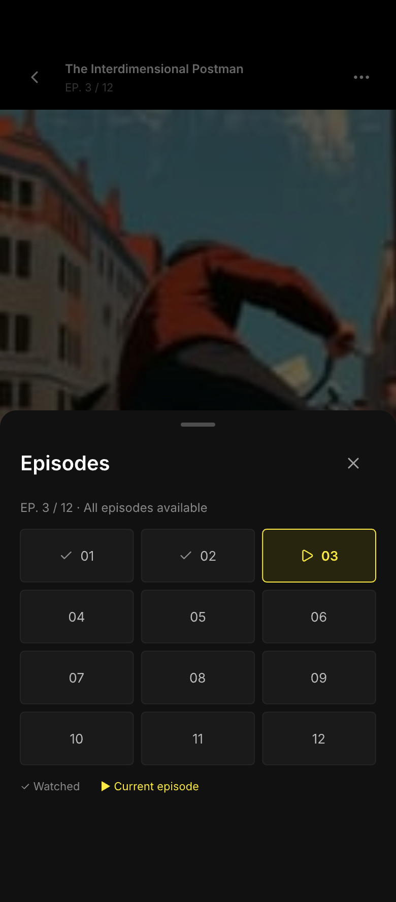
The mobile viewing layout gives space to portrait video and moves episode selection into a bottom sheet. Continue Watching remains prominent on the home screen. The free countdown retains distinct Play Next and Cancel controls, so moving to touch does not change the viewing rules.
The paid mobile path uses the same prices, balances and episode states as desktop. Relevant quick payment is prominent, with card payment available as an alternative. The confirmation names the charge and unlock, and the success view returns to the same episode. The information hierarchy changes for the smaller screen; the purchase contract does not.
Free viewing and episode control
Top up, confirm and continue
Use a shared language for actions and states
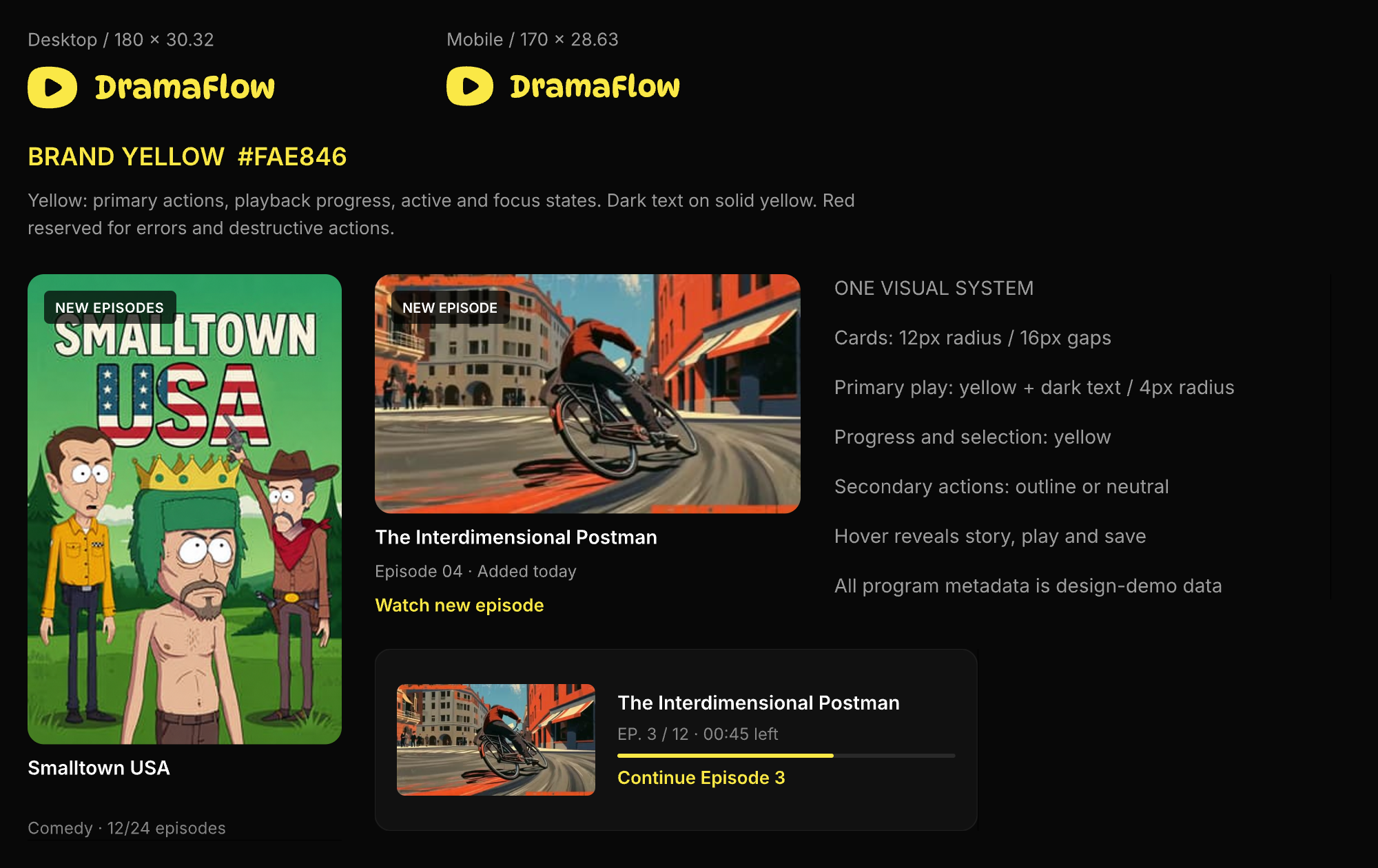
DramaFlow’s rounded wordmark establishes a playful identity against dark content surfaces. Its yellow connects primary actions, selected episodes and progress; dark text keeps filled controls legible. Shared series cards, resume cards and update patterns carry that hierarchy across pages.
The same hierarchy extends to monetization: the primary payment or unlock action uses yellow, while pack selection, balance information and secondary exits remain distinct. Error and destructive states keep their semantic colors. Shared rules for labels, episode states and balances connect the component library to the complete journeys.
Measure the whole journey, then refine the offer
The business hypothesis is that a contextual offer, an understandable coin budget and a reliable return to playback will help interested viewers complete a first purchase. The proposed funnel records eligible exposure, lock view, top-up selection, checkout start, confirmed payment and Episode 4 playback. A payment-button click is not a completed purchase.
The first experiments would compare offer placement, how the recommended pack is explained and the relevant payment-method presentation. Pricing and content access should remain consistent when testing a presentation change. The decision would consider net revenue per eligible viewer and post-payment playback alongside conversion, with D7 return, refunds, payment errors and support contacts as guardrails.